03.11.2017
Avaliação 
Avalie
 
Sem votos
Avaliar
arquitetura-efêmera-portobello-barbara-cassou5

Ephemeral Architecture: ever heard of it?

 minutos de leitura
calendar-blank-line
03.11.2017
Expressed in various ways, this architecture has a limited time to exist in the space in which it is inserted. Check out some examples!
minutos de leitura

Designing an ephemeral architecture is not just designing something temporary. It means to tell a story, to carry on an abstract concept, to create experiences through constructive aspects and communication. And the projects must be very well thought out to impact on the little time that they will remain available.

Some examples of ephemeral architecture are: design of booths, showcases, promotional animations, pop-up stores, exhibition design or even a set developed for a fashion show. In other words, any and every environment designed for a short period of time, regardless of the purpose: exhibiting the works of an artist, selling a limited edition product, or promoting a brand.

Is it not clear yet? Check out our examples below!

Dior – Spring Summer 2018
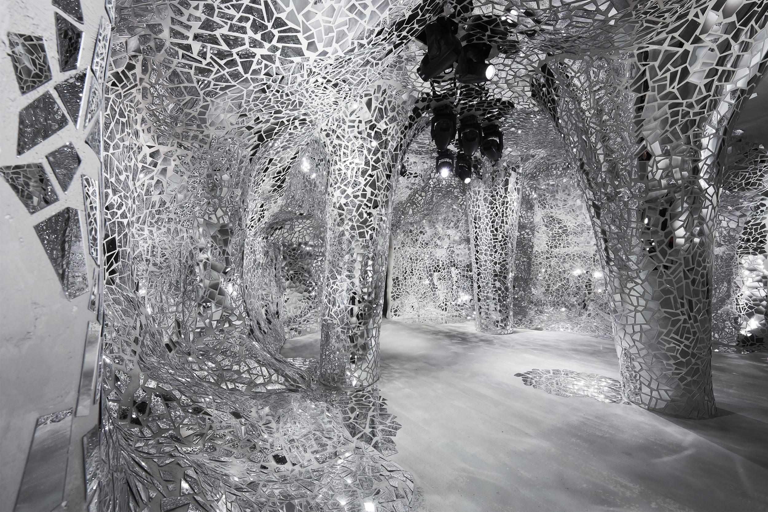
Inside space of the fashion show, where the models walked by. (Photo: reproduced from Dior website)

For the 2018 Spring/Summer fashion show, Dior created a spectacular setting. The fashion shown was inspired by the fairy tales, with treasures, dragons, magicians and princesses.

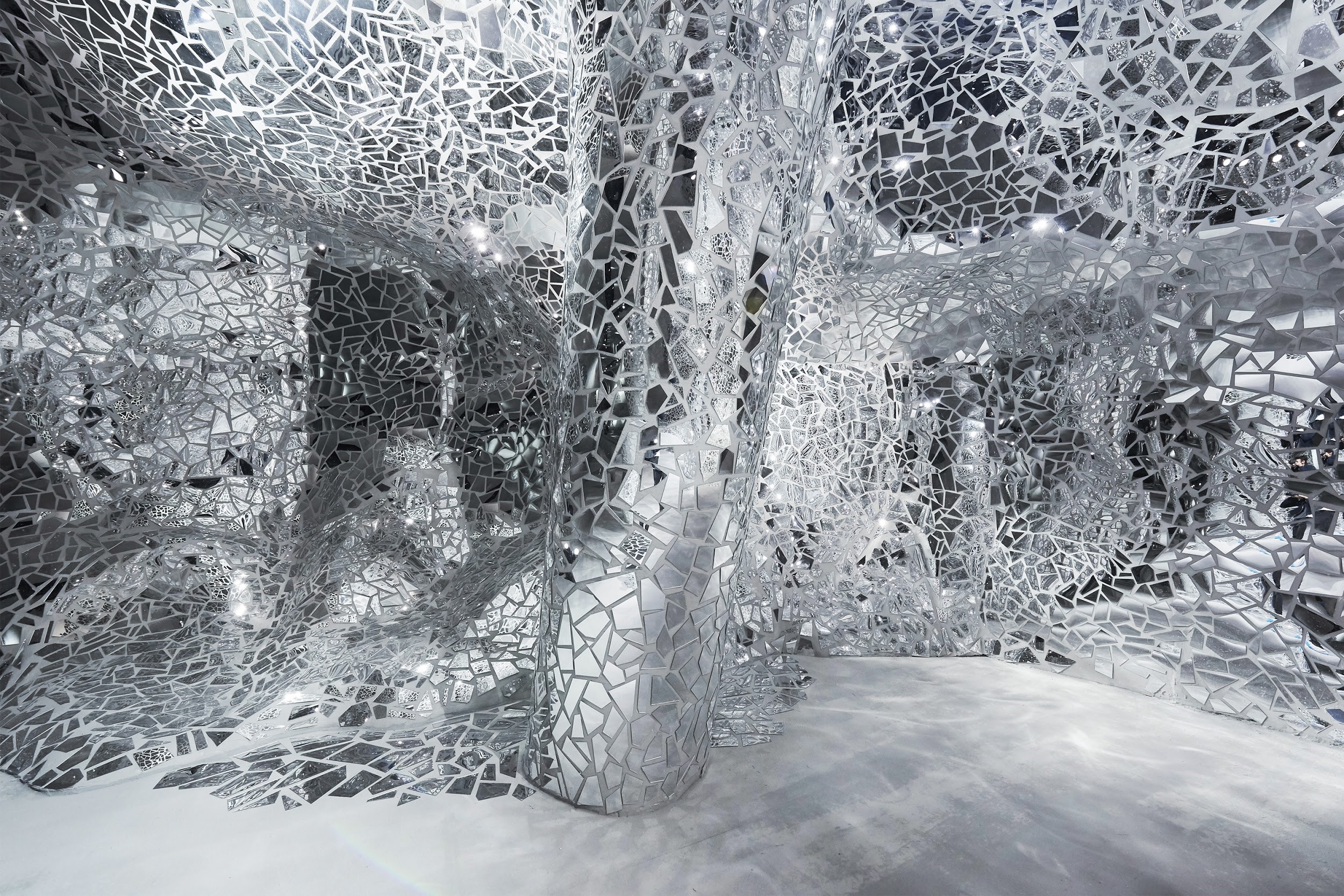
Thus, in the middle of the garden of the Rodin Museum, in Paris, a cave was designed with the interior covered by pieces of mirrors, forming a mosaic of reflections. Personally, I found it a little inspired by Gaudí (to learn more about him and his works, read the article about The mysteries of Gaudí architecture in Barcelona).
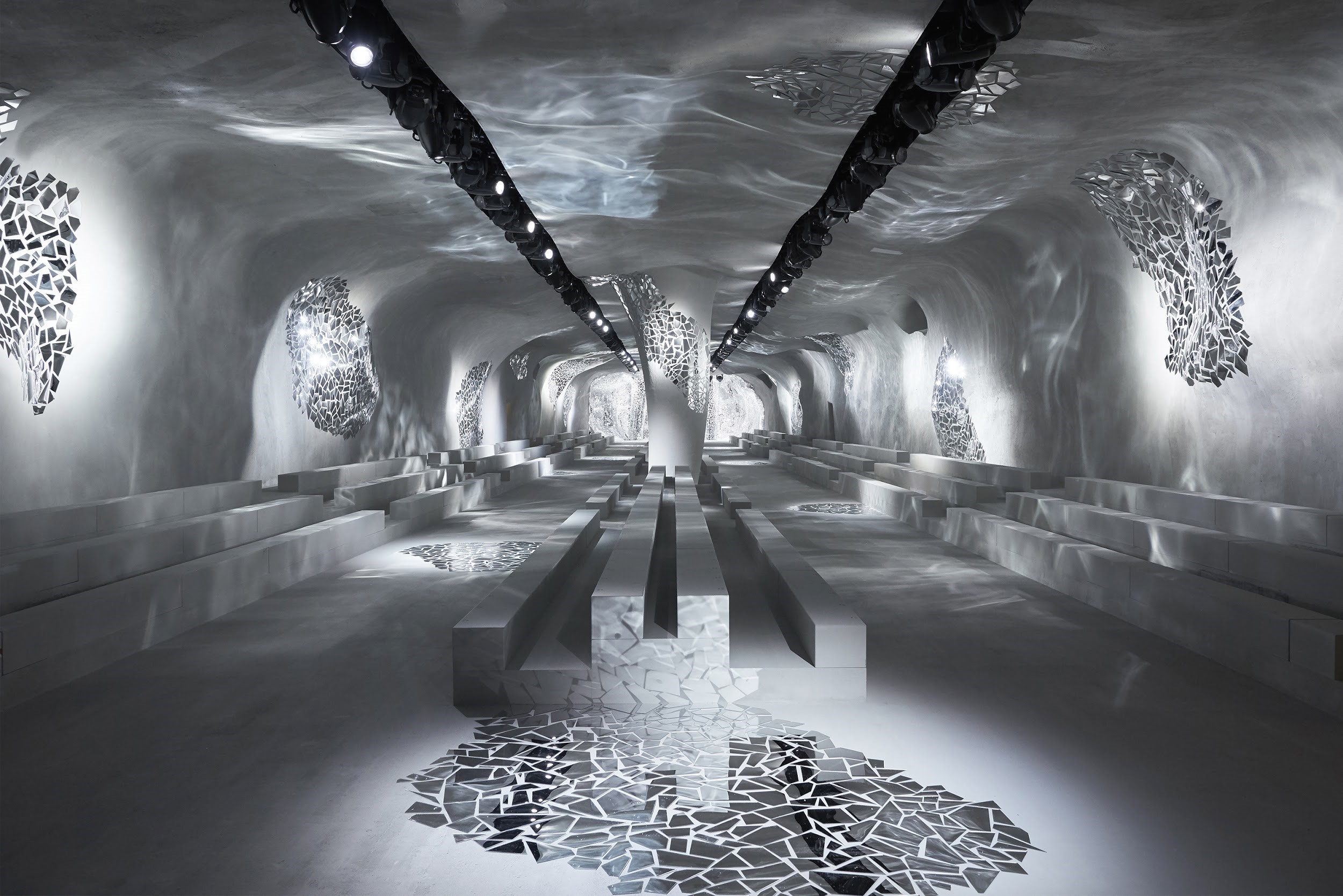
The seats for the guests to sit were continuous and integrated into space. (Photo: reproduced from Dior website)


Detail of glass mosaic on the wall and column. (Photo: reproduced from Dior website)

Leonardiana

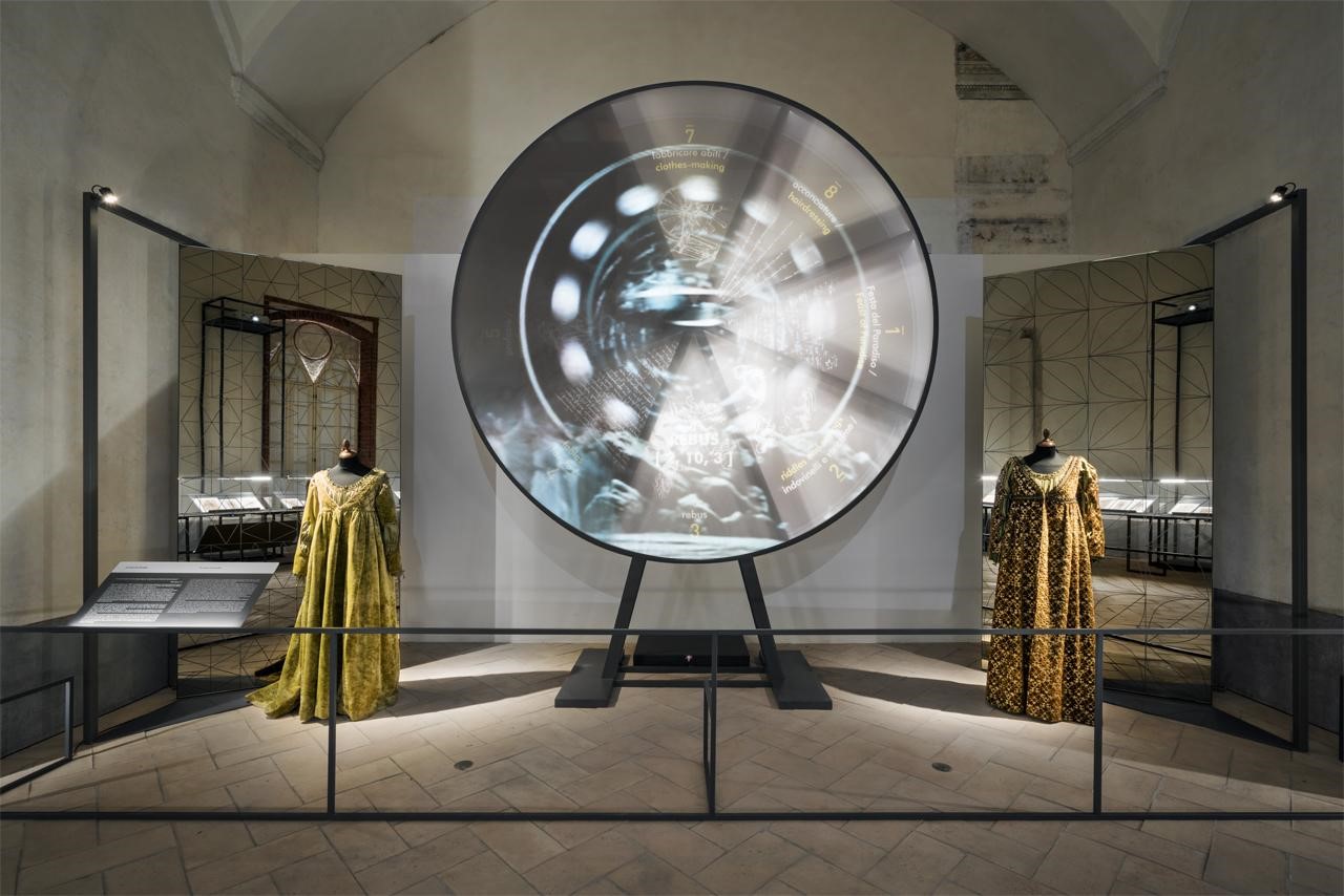
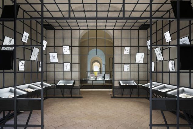
A project that combines history, art and ancient architecture with multimedia technologies and simple structures. This is an exhibition located in the Castle of Vigevano, Italy, with part of its interior dedicated to Leonardo da Vinci.
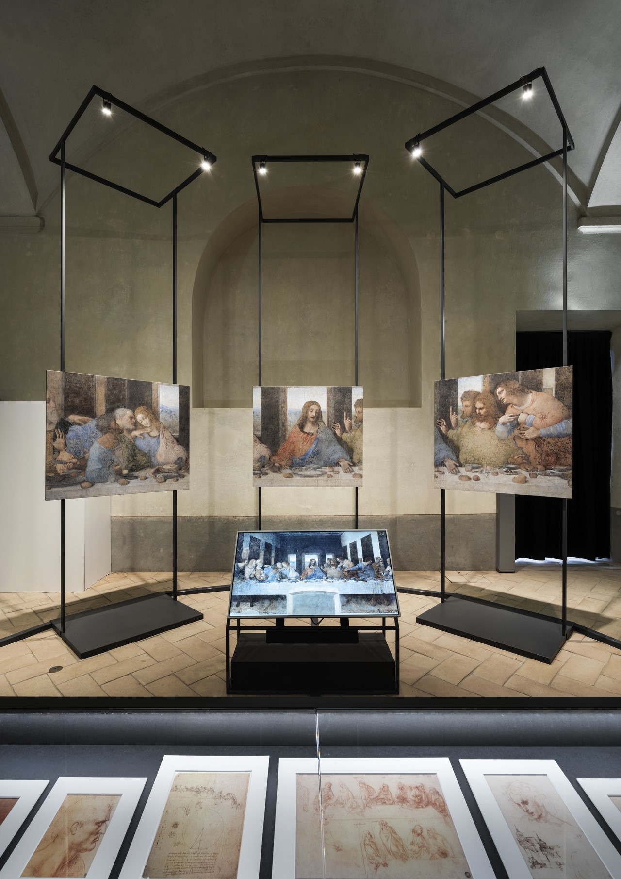
Interactive panels allow visitors to see the work in zoom-in mode. (Photo: Andrea Martiradonna / BAMSphoto-Rodella / reproduced from the website of Migliore and Servetto studio)

The main exhibition, called “Leonardiana”, was designed by the Italian studio Migliore+Servetto Architects, which used multimedia systems and advanced lighting, creating storytelling through music, reproduction of sketches, scientific research and interactive systems.
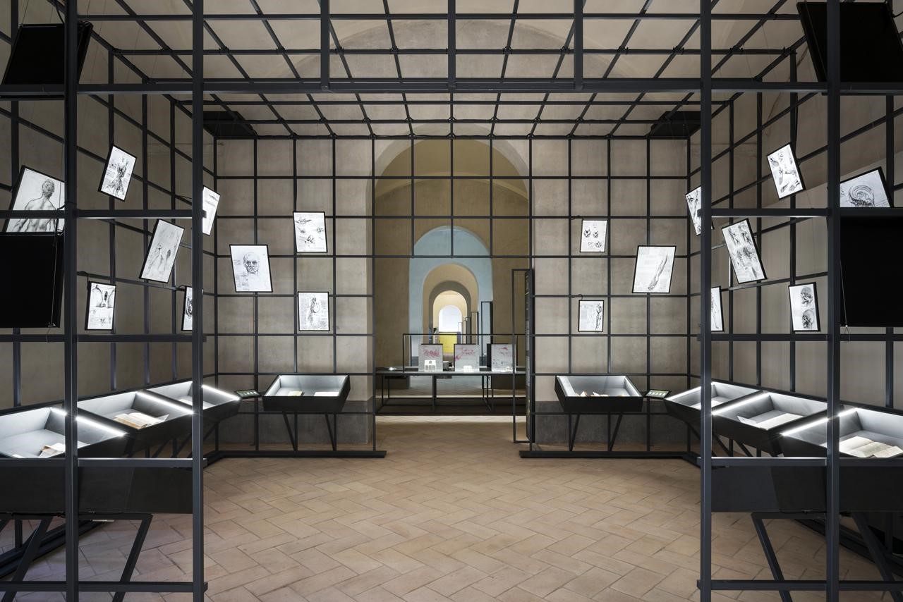
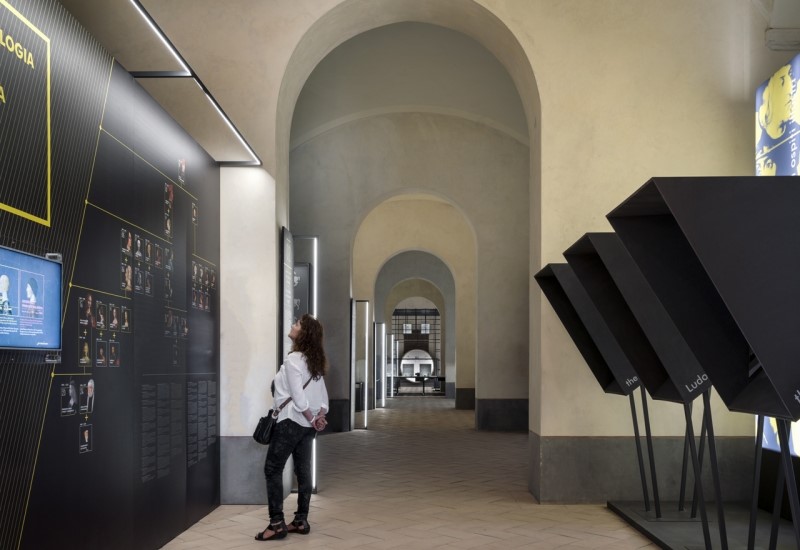
Metal structures create environments to exihbit works. (Photo: Andrea Martiradonna / BAMSphoto-Rodella / reproduced from the website of Migliore and Servetto studio)


 Loose walls and black exhibitors make contrast with the old interior architecture. (Photo: Andrea Martiradonna / BAMSphoto-Rodella / reproduced from the website of Migliore and Servetto studio)
Loose walls and black exhibitors make contrast with the old interior architecture. (Photo: Andrea Martiradonna / BAMSphoto-Rodella / reproduced from the website of Migliore and Servetto studio)


Different formats of multimedia elements. (Photo: Andrea Martiradonna / BAMSphoto-Rodella / reproduced from the website of Migliore and Servetto studio)

One scenario exhibits a combination between the original art and the narrative replica in multimedia.
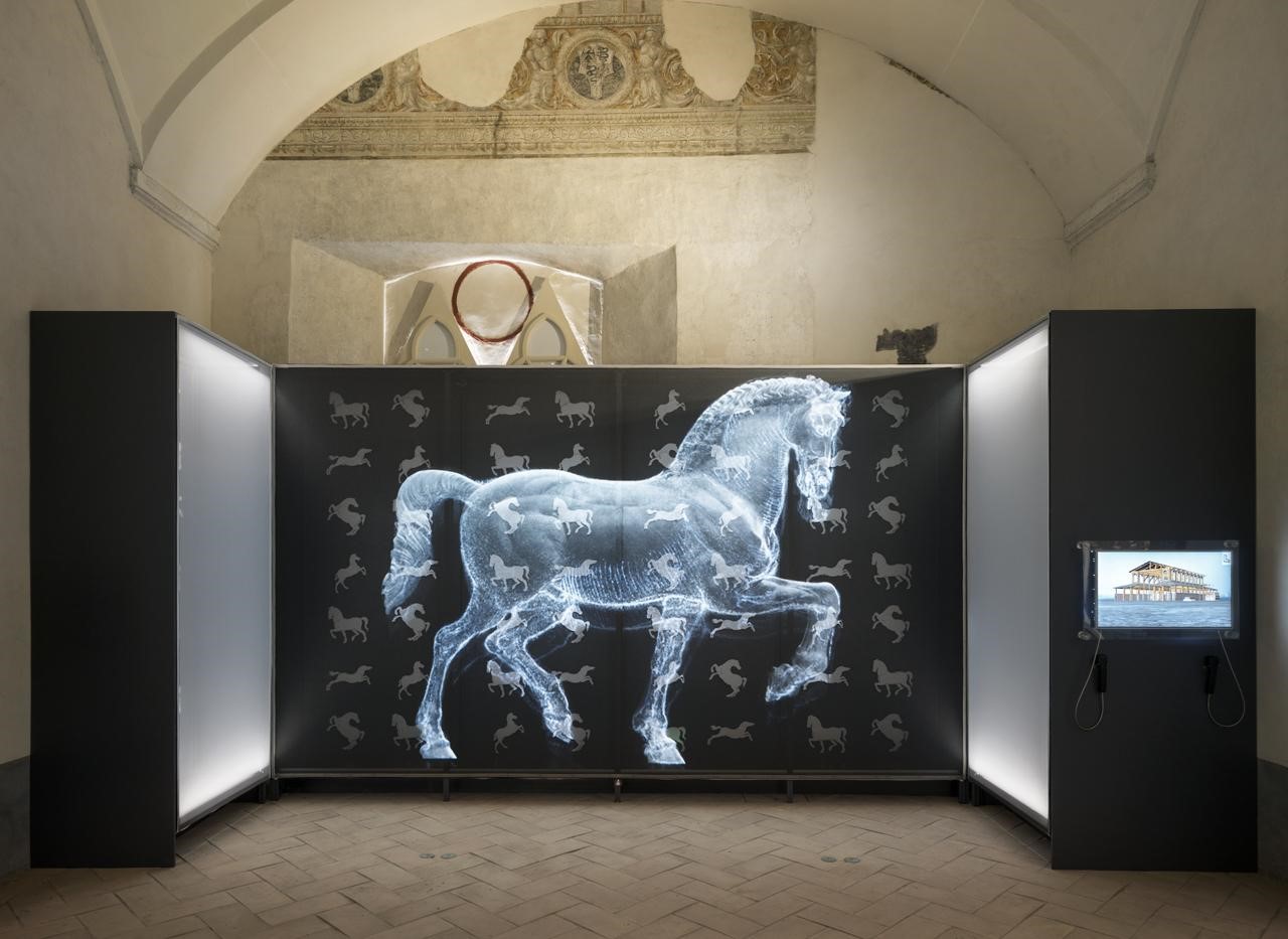
Detail of another multimedia part of the exhibition. (Photo: Andrea Martiradonna / BAMSphoto-Rodella / reproduced from the website of Migliore and Servetto studio)

Microsoft Home

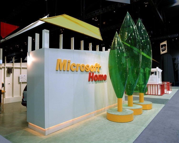
A specialist in booth design, Mauk Design studio designed a space for Microsoft to show the wide variety of technologies that contribute to the electronic integration of a home.
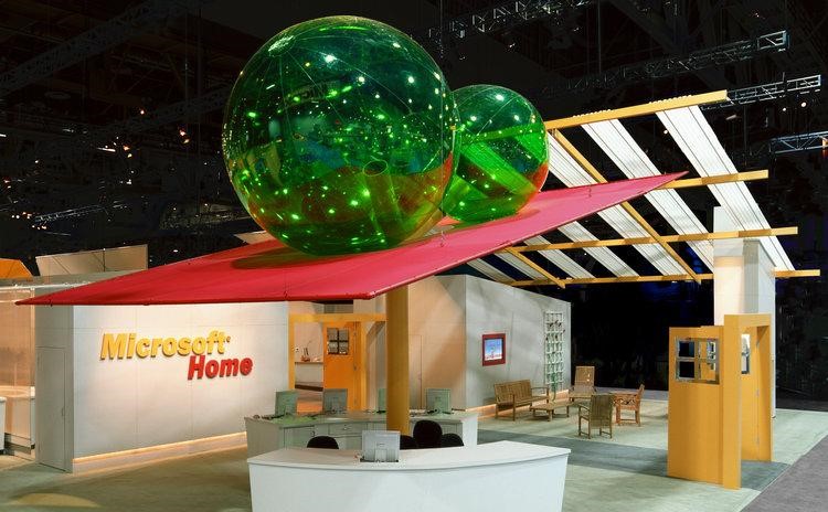
Detail of the balcony of the booth. (Photo: reproduced from the website of Mauk Design studio)

The simple but well-designed solution was literally to showcase these technologies in a home. And, for the project to become more interesting and less cliché, the designer chose codes of a home (such as fence, roof, door), exhibiting them in a deconstructed manner and with a touch of humor.
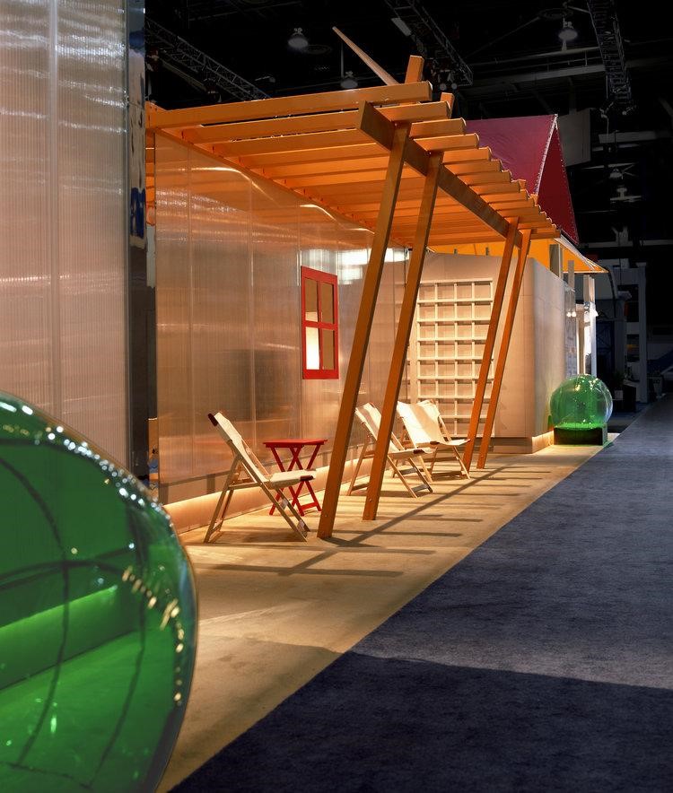
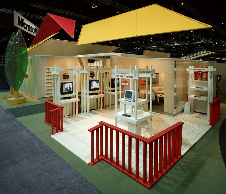
Reinterpretation of a deck and garden. (Photo: reproduced from the website of Mauk Design studio)


 Reinterpretation of a deck and garden. (Photo: reproduced from the website of Mauk Design studio)
Reinterpretation of a deck and garden. (Photo: reproduced from the website of Mauk Design studio)


Second facade of the booth. (Photo: reproduced from the website of Mauk Design studio)

Hermès Souffle

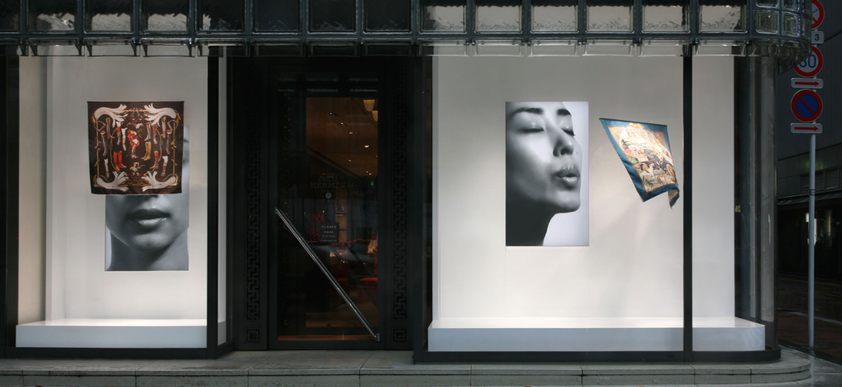
Hermés shop window directly facing the street. (Photo: reproduced from the website of Tokujin's architecture firm).

A simple window with only two elements: the product and a video. But much more than a simple arrangement, this installation of Tokujin Yoshioka, specially created for this launch of Hermès, was beyond expectations. The video creates a false interaction with a handkerchief, causing a movement inside the window.

COS pop-up store
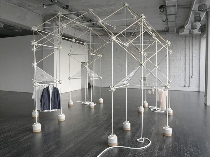
Main structure to exhibit clothes. (Photo: Owen Richards / reproduced from the website of Bonsoir Paris studio)

Only during Milan’s Design Week, the Swedish clothing brand COS opened a pop-up store designed by French studio Bonsoir Paris. With the same concept of the brand, the space was designed with a simple, functional and minimalist “look & feel”.
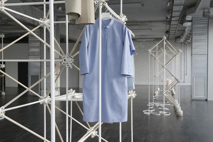
Detail of the exhibition of a clothing piece. (Photo: Owen Richards / reproduced from the website of Bonsoir Paris studio)

Fitting and tube modules formed the exhibitors in the middle of an empty and sober space, emphasizing only the clothing items.
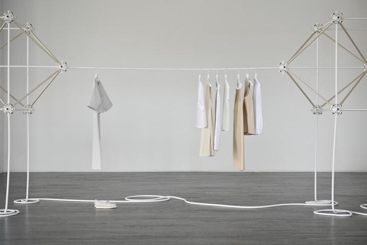
Connection between structures. (Photo: Owen Richards / reproduced from the website of Bonsoir Paris studio)

Abstract concepts, graphic elements, multimedia installations, scenery and decorations generate content for ephemeral architecture to become something that people can contemplate and experience. Highly creative designs that, for a short time, have to make an impact so that you always keep them in your memory.
Compartilhe
Avaliação 
Avalie
 
Sem votos
VOLTAR
ESC PARA FECHAR
Minha avaliação desse conteúdo é
0 de 5
 

Ephemeral Architecture: ever heard of it?...

Ephemeral Architecture: ever heard of it?

  Sem votos
minutos de leitura
Em análise Seu comentário passará por moderação.
Você avaliou essa matéria com 1 estrela
Você avaliou essa matéria com 2 estrelas
Você avaliou essa matéria com 3 estrelas
Você avaliou essa matéria com 4 estrelas
Você avaliou essa matéria com 5 estrelas

Deixe um comentário

O seu endereço de e-mail não será publicado. Campos obrigatórios são marcados com *

Bárbara Cassou
Colunista
Correspondente internacional

Bárbara Cassou, correspondente internacional Portobello em Barcelona Arquiteta e designer, mestre em Retail Design...

Conhecer artigos


Não perca nenhuma novidade!

Assine nossa newsletter para ficar por dentro das novidades de arquitetura e design no Brasil e no mundo.

    O Archtrends Portobello é a mais importante fonte de referências e tendências em arquitetura e design com foco em revestimentos.

    ® 2024- Archtrends Portobello

    Conheça a Política de Privacidade

    Entenda os Termos de Uso

    Veja as Preferências de Cookies